
A good marketing poster has a deceptively difficult job: it needs to catch attention, communicate a clear message, and encourage someone to take action—all within...
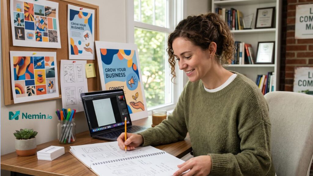
A good marketing poster has a deceptively difficult job: it needs to catch attention, communicate a clear message, and encourage someone to take action—all within a few seconds.
For freelancers, agencies, startups, and small businesses, that challenge matters. A poster might promote a local event, announce a new service, advertise a limited-time offer, or support a social media campaign. But creating something visually strong shouldn’t require hours of design work or a large creative budget.
That is where modern design tools can make a practical difference. An AI poster maker can help turn an initial idea into a polished visual concept much faster, giving marketers and business owners more time to focus on the strategy behind the campaign.
Start With the Marketing Goal, Not the Design
One of the most common mistakes is opening a design tool before deciding what the poster actually needs to accomplish.
Start with one question:
What should the viewer do after seeing this?
The answer might be:
- Visit your website
- Book a consultation
- Attend an event
- Claim an offer
- Follow your social media account
- Call your business
- Learn about a new product
Once the desired action is clear, the design becomes easier. Every major element—from the headline to the imagery—can support that objective.
For example, imagine a freelance marketing consultant promoting a free 30-minute strategy session. A poster filled with paragraphs about marketing services is unlikely to perform as well as one built around a simple message such as “Free 30-Minute Marketing Audit,” followed by a short explanation and a clear booking instruction.
The design serves the offer. It doesn’t compete with it.
Make the Main Message Impossible to Miss
People rarely study promotional graphics from top to bottom. They scan them.
Your headline therefore needs to do most of the initial communication.
A strong poster hierarchy usually includes three levels:
Primary message: The most important thing the viewer needs to know.
Supporting message: A short explanation that adds context.
Call to action: The next step you want the viewer to take.
Consider a small business promoting a weekend sale. Instead of giving every product and condition equal visual weight, the poster might emphasize:
20% OFF THIS WEEKEND
Then provide a brief supporting line and the website or store information.
This approach makes the poster understandable even when someone only glances at it while scrolling through a social feed.
Keep the Copy Short and Specific
Good poster copy isn’t about saying everything. It’s about saying enough.
If your poster requires several paragraphs to explain the offer, you may actually be trying to turn a poster into a brochure.
A useful editing exercise is to remove anything that doesn’t help the reader understand the offer or take action. Look for unnecessary adjectives, repetitive descriptions, vague claims, and lengthy explanations.
Instead of:
“We are excited to announce that our company is now offering a comprehensive range of highly effective digital marketing services designed specifically to help businesses achieve their online growth objectives.”
Try:
Need More Qualified Leads?
Practical SEO and paid advertising support for growing businesses.
The second version gets to the point much faster.
Design for the Platform
A poster isn’t automatically effective simply because it looks good.
Where it will appear matters.
A printed poster in a storefront can contain slightly more detail because people may stop and read it. A graphic shared on Instagram or LinkedIn needs to communicate much faster. A digital event poster might need to work equally well on a phone and a larger screen.
Before designing, determine:
- Where will the poster be published?
- What dimensions does that platform require?
- Will people see it on mobile devices?
- How far away might someone view a printed version?
- Does the design still make sense without additional explanation?
Creating several versions from the same core concept can also make a campaign more consistent across channels.
Use Visual Hierarchy to Guide the Eye
Visual hierarchy is one of those design concepts that sounds complicated but is fairly intuitive.
You want to control the order in which people notice things.
Typically, the viewer should see the main headline first, the supporting information second, and the call to action third.
Size, spacing, contrast, positioning, and typography can all help establish that hierarchy.
One practical test is to look at your poster for two or three seconds and then look away. Ask yourself what you remember.
If you remember the background image but not the offer, the design probably needs adjustment.
If you remember the headline and the action you are supposed to take, you’re moving in the right direction.
Choose Images That Reinforce the Message
A striking image can attract attention, but visual appeal isn’t enough.
The image should have a reason for being there.
A restaurant advertising a new seasonal dish might use a close-up photograph of the food. A fitness business could feature an energetic training scene. A software company might use a clean product interface or an abstract visual that communicates its technology.
Avoid choosing imagery simply because it looks impressive.
A crowded background can make text difficult to read. A generic stock image can make a business feel interchangeable. An overly complicated illustration can distract from the call to action.
When in doubt, choose clarity over decoration.
Don’t Forget Branding
A poster should look like it belongs to your business.
That doesn’t mean covering every corner with logos and brand elements. Instead, establish a recognizable visual system through consistent colors, fonts, imagery, and tone.
For a small business running multiple campaigns, this becomes particularly useful. Customers may begin recognizing promotional content before they even read the company name.
Keep a simple brand reference available when creating marketing materials:
- Primary and secondary colors
- Preferred fonts
- Logo variations
- Photography style
- Tone of voice
- Standard call-to-action language
This saves time and makes future campaigns easier to produce.
Think About the Business Economics
Design is only one part of marketing. The other question is whether the campaign makes financial sense.
Suppose you’re spending $500 promoting an event or special offer. You need to know what result would justify that expense.
If the campaign generates $2,000 in additional profit, that’s a very different outcome from generating $300.
Simple calculations can help you estimate break-even points, advertising returns, profit margins, and campaign performance before committing a significant budget. For small businesses in particular, understanding these numbers can prevent creative decisions from being separated from commercial reality.
A beautiful poster is useful. A beautiful poster attached to a profitable campaign is much better.
Test Different Versions
Don’t assume the first design is automatically the best one.
Try changing one major variable at a time:
- Headline
- Main image
- Call-to-action wording
- Offer presentation
- Layout
- Amount of supporting copy
For digital campaigns, performance data can help reveal which version gets more clicks, inquiries, registrations, or sales.
Even without sophisticated analytics, informal feedback can be valuable. Show two versions to colleagues or customers and ask a simple question:
“What do you think this poster is asking you to do?”
If their answers are unclear, the design probably needs more work.
Create Faster Without Sacrificing Strategy
Speed is valuable for small businesses because marketing often happens alongside everything else—client work, operations, sales, customer service, and financial planning.
The goal shouldn’t be to produce visuals as quickly as possible just for the sake of speed. It should be to reduce repetitive production work while preserving thoughtful decision-making.
A practical workflow looks something like this:
- Define the campaign objective.
- Identify the target audience.
- Write one strong headline.
- Add only essential supporting information.
- Choose an appropriate visual direction.
- Apply consistent branding.
- Add a clear call to action.
- Create versions for the intended platforms.
- Review the design at a glance.
- Measure the result after publication.
This process keeps the creative work connected to the business objective.
The Best Poster Is the One That Communicates Clearly
Small businesses don’t need complicated marketing systems to create effective visual campaigns. They need a clear message, a defined audience, sensible design choices, and a way to evaluate whether the effort produced a worthwhile result.
Modern creative tools can make production considerably easier, but strategy still comes first. When the purpose of the poster is clear, the design has a much better chance of getting noticed—and, more importantly, getting people to act.
For freelancers, marketers, agencies, and business owners, that combination of efficient creation and practical decision-making can turn a simple promotional graphic into a useful part of a broader marketing strategy.